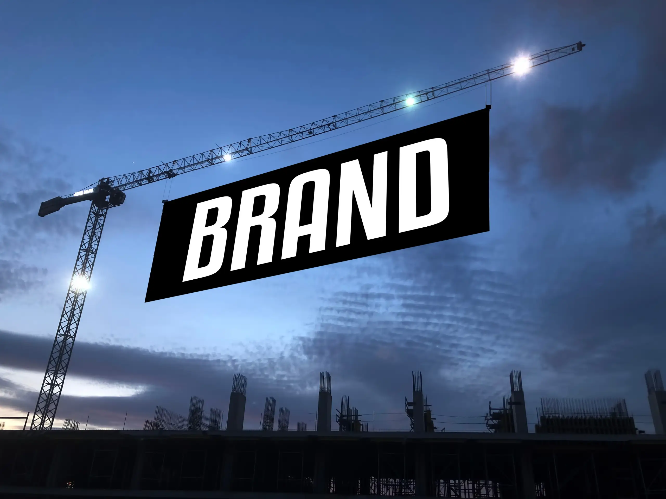
For years, many businesses believed branding began and ended with a logo. But in today’s world, where customers interact with brands through screens, packaging, platforms, and countless touchpoints, a logo alone is no longer enough. Modern brands thrive not because they have a “beautiful mark,” but because they operate as complete systems: unified, intentional, and consistent. A brand becomes powerful when every element—color, type, layout, photography, tone—works together to express the same story.
A logo is important, it’s the entry point, the anchor, the familiar face. But it is still just one piece of a much larger ecosystem.
A logo cannot:
It can spark recognition, but it cannot sustain it alone.
Brands that rely purely on a logo often feel inconsistent, disconnected, or generic. Brands that rely on a full system feel intentional, premium, and confident.

A brand identity system is the complete set of visual rules and elements that maintain the brand’s expression across every platform.
A strong system includes:
Primary, secondary, stacked, and icon variations, ready for different contexts.
Headline fonts, body fonts, spacing, hierarchy. The typography alone can communicate 60% of a brand’s personality.
Not random aesthetics, but psychological choices: calm, bold, natural, youthful, premium, technical.
Margins, spacing patterns, alignment logic, this is what makes a brand feel organized.
Mood, lighting, subject matter, angles, texture. A photography system often communicates more emotion than the logo itself.
Patterns, shapes, lines, supporting marks, subtle assets that make the brand feel unique.
How things move on screen: soft, snappy, elegant, minimal. Motion communicates attitude.
Together, these form a cohesive language, one that can scale beautifully.

Many early-stage brands rely on a logo because it seems simple and affordable.
But this often leads to challenges:
A logo cannot carry the entire brand alone, just like a single melody cannot carry an entire symphony.

Look at any enduring brand: luxury, tech, lifestyle, hospitality.
They all share the same truth: their power comes from consistency, not complexity.
Apple, Aesop, Muji, Chanel, Airbnb, and even global NGOs—none rely on logos alone.
Their systems communicate:
This emotional clarity is built through the system, not the mark.
At NAMU ART DESIGN, we see branding as a living ecosystem, not a decorative symbol. Our process blends story, meaning, and visual order into a calm, premium identity.
We focus on:
Our goal isn’t just to design a logo.
Our goal is to build a visual language that grows with the brand, rooted in meaning, refined in execution, and timeless in expression.