Before a customer touches a product, reads its ingredients, or learns the brand story, the packaging has already spoken. In retail environments, both physical and digital, packaging acts as a silent salesperson: communicating quality, emotion, and intention without saying a word. For lifestyle and premium brands, packaging isn’t just a container. It’s the first impression, the first experience, and often, the first moment of trust.
Long before people experience what’s inside, they judge the brand through its exterior.
Packaging introduces:
A minimalist, well-crafted package suggests refinement.
Rich textures suggest luxury.
Natural materials suggest honesty and authenticity.
Every choice influences how customers interpret the brand, often within the first three seconds.

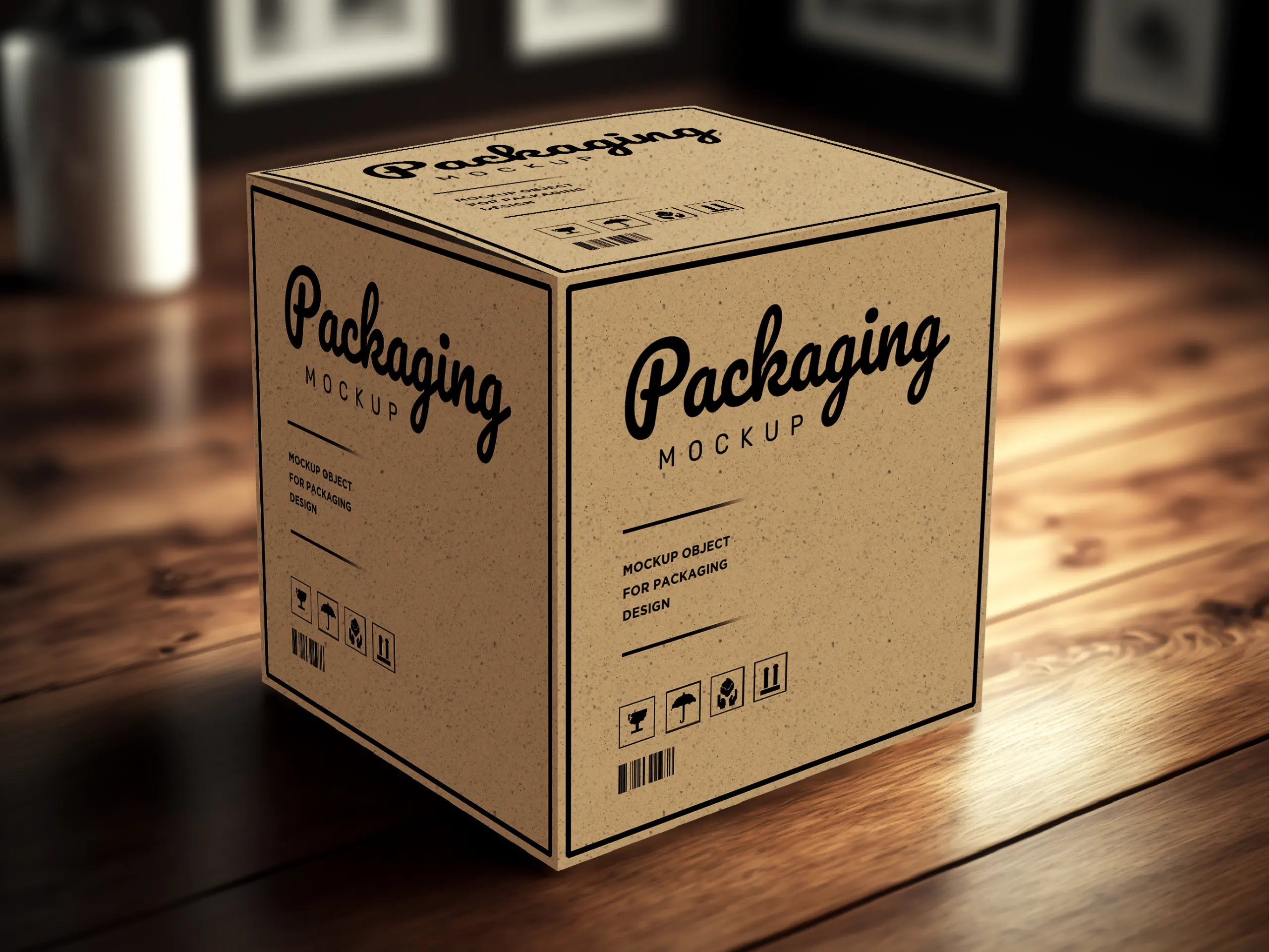
Packaging isn’t only visual, it’s structural.
The form carries meaning:
Premium brands use structure as a storytelling tool.
The physical form becomes a sculpture that embodies the personality of the brand.

Colors evoke emotion instantly:
Materials reinforce these emotions:
The combination of color + material is a subtle psychological message about what the brand stands for.

Typography on packaging guides the eye and creates clarity.
Premium brands favor:
This creates calm readability, an essential part of premium design.
When typography is clean and intentional, customers subconsciously perceive the brand as more trustworthy, mature, and detail-oriented.
For premium brands, packaging extends beyond the shelf, it becomes a ritual.
The unboxing moment builds anticipation and deepens emotional connection.
Sensory details such as:
These details make the customer feel valued, and increase the likelihood of repeat purchase.

At NAMU ART DESIGN, we see packaging as more than a wrapper, it is a strategic extension of the brand’s soul. We combine brand storytelling, material sensitivity, and calm visual language to create packaging that feels premium from the very first glance and touch.
Our approach focuses on:
The result is packaging that quietly sells for you, on the shelf, online, and in the hands of your customers, by making your brand feel thoughtful, trustworthy, and worth coming back to.